Present a Website Design Through One Customer Task
A short task-led presentation connects the page’s visual choices with the customer’s decision, without turning a design review into a claimed user test.
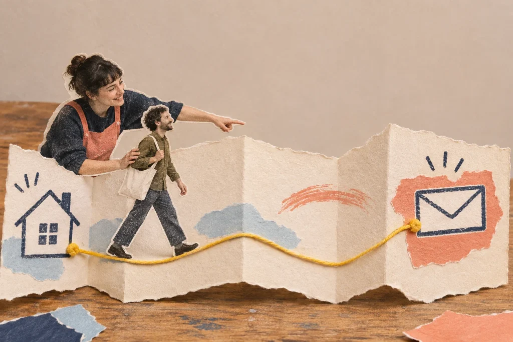
The client sees a polished opening screen and immediately discusses the photograph. You planned to explain how the whole site works. A customer task gives the presentation a route through the design, so the conversation has somewhere useful to go.
Choose a task with a recognisable finish
In this fictional example, a designer is presenting a website for a dog-grooming business. The selected task is to find whether a first appointment suits a particular dog and understand how to request one. The finish is an informed enquiry, not a completed booking that the draft does not yet support.
Choose a task the intended website really needs to support. It should expose a meaningful sequence of information and action. “Look at our services” names a section; “find which appointment to ask about and what details to send” gives the walkthrough a purpose. Keep other customer journeys for another review rather than forcing the whole business into five minutes.
Spend the first minute on the starting situation
Tell the client who you are following and what that person knows. For the grooming example: a new customer has a nervous adult dog, knows the business name and wants to ask whether an introductory visit is appropriate. This is a planning scenario, not a researched customer persona or a report of visitor behaviour.
Name the decision you want from the presentation: does this proposed journey put the necessary service information before the enquiry? State what is provisional, such as an unapproved photograph. Do not let a beautifully rendered draft imply that its content, receiving process or live interactions have already been accepted.
Use minutes two and three to follow the route
Open the starting page and narrate only what relates to the task. Point to the service description, the explanation of the introductory visit and the information needed for an enquiry. Explain a design choice when it helps the client understand the route: “This short note stays beside the action because the visitor needs to know what to include.”
Avoid describing every font, panel and animation. Those choices can matter, but a running catalogue turns the presentation back into a tour. If a page does not supply something the scenario needs, pause and mark the gap. Do not verbally fill missing information and then describe the page as clear. Your spoken explanation is part of the presentation, not evidence that the page works independently.
Use minute four to ask for an interpretation
Let the client describe what they think a visitor would understand at the decision point. Ask: “What would someone believe they are requesting here?” Then ask which important condition is missing or ambiguous. The client can contribute business knowledge that the design alone cannot settle.
If the reply is “I like it”, make the question more concrete. In the example, ask whether the enquiry could be mistaken for a confirmed appointment and which wording should prevent that. If the client proposes a larger button, keep their concern connected to this task before debating the treatment. Record a style preference separately when it is genuinely the subject.
Use the last minute to agree one decision
Read back the outcome: “We will describe this as an introductory enquiry and ask for the dog’s relevant details before submission. The appointment remains subject to your response. You will confirm that instruction; I will revise its position and wording.” Include who supplies the missing information and which part will be shown again.
A compact walkthrough card has six lines: customer starting situation; intended finish; route shown; information needed before action; client finding; agreed next revision. Keep the relevant page or review version with the card. This gives a colleague the reason behind a design change rather than only its new appearance.
Keep the claim proportionate
A task-led client presentation can reveal misunderstanding in this conversation. It does not establish conversion performance or prove that unfamiliar customers can complete the journey. If you need that evidence, plan a separate evaluation with appropriate participants and methods. The immediate value here is a bounded business and design decision that survives the meeting.
Choose one customer task for the walkthrough and keep the relevant page visible while discussing it. A review method is useful when it preserves that context for the next revision.
For a vague reaction during the walkthrough, use three questions after “make it pop”. To organise a later asynchronous round, adapt a first-review email with a clear job.
Discussion 0
What did this article make you think about?